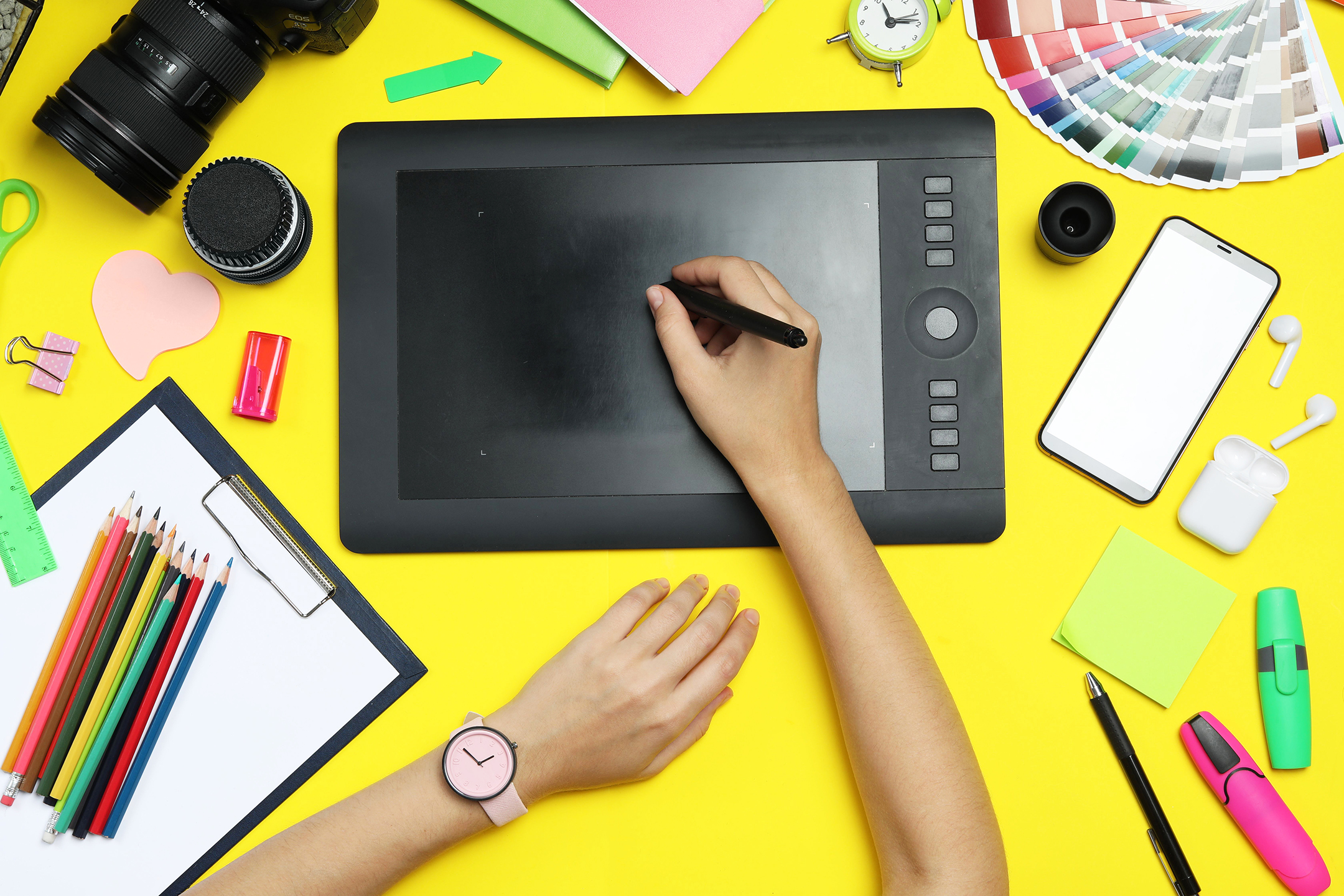
The fastest way to waste money on custom shirts is to start with artwork before you know what the shirt needs to do. If you are figuring out how to make your own t shirt design, begin with the job the shirt has to perform. A company giveaway needs different design choices than a school fundraiser, staff uniform, team warmup, or artist merch drop. Good shirt design is not just about what looks nice on a screen. It is about what prints clearly, wears well, and makes sense for the people who will actually put it on.
That is where many first-time buyers get stuck. They focus on the graphic and overlook the shirt style, print method, audience, and quantity. Those details shape the final result just as much as the artwork does.
Start with purpose, not software
Before you open any design app, answer three simple questions. Who is wearing the shirt? Where will they wear it? How many shirts do you need?
If the shirt is for employees, readability and brand consistency usually matter more than a complex illustration. If it is for a school event, spirit and visibility may matter more than subtle design details. If it is retail merch, the shirt has to feel worth buying, not just acceptable as a giveaway.
Quantity matters too. A one-color design for 500 event shirts is often the smart move because it keeps costs controlled and stays easy to read at a distance. A smaller run for a brand launch may justify more decoration detail or specialty placement. There is no single right answer. The best design is the one that fits the use case and budget at the same time.
How to make your own t shirt design that actually prints well
A shirt design can look sharp on your laptop and still fail in production. Thin lines may fill in. Small text may disappear. Color combinations that pop on a white background may fall flat on a dark garment.
That is why strong shirt design starts with print reality. Keep the artwork clean. Use readable type. Make sure the main idea is clear from several feet away. If someone has to study the shirt to understand it, it may be too complicated for the purpose.
The safest approach is to build around one focal point. That could be a logo, phrase, mascot, event name, or illustration. Then support it with secondary details only if they add value. Dates, sponsor names, locations, and department names can all be useful, but not if they turn the design into a cluttered page.
Pick the right shirt first
Design and garment selection go together. A design made for a lightweight fashion tee may not feel right on a heavyweight work shirt. Similarly, a left-chest logo that looks appropriate on a polo may look too small on a casual event tee.
Think about fabric color early. Ink colors change depending on the garment underneath. White ink on black cotton behaves differently than navy ink on athletic gray. Heathered shirts can soften printed colors. Performance fabrics may call for different decoration methods than standard cotton.
Fit matters too. If the shirt is for a broad group, choosing a universally wearable style often gives you a better result than chasing trends. A dependable shirt with a clear design usually outperforms a fashionable blank that only works for part of the audience.
Keep the design simple enough to win
Simple does not mean boring. It means intentional.
Some of the best custom shirts use only one or two ink colors and a straightforward layout. That is especially true for business uniforms, staff apparel, school shirts, and event pieces where recognition matters more than artistic complexity. A strong front print, balanced spacing, and colors with enough contrast can do a lot of work.
When designs become busy, the message gets lost. This happens often with commemorative shirts that try to include every slogan, every sponsor, and every visual idea at once. If you need to include a lot of information, split it strategically. Put the main branding on the front and the supporting details on the back. That gives the artwork room to breathe.
Choose colors with production in mind
Color is one of the biggest drivers of both impact and cost. More colors can create a richer look, but they can also add setup complexity depending on the print method and quantity.
For many orders, fewer ink colors produce a cleaner result and a smoother production process. High-contrast combinations tend to read better from a distance and across mixed sizes. Dark ink on light shirts and light ink on dark shirts are reliable starting points.
Be careful with trendy color choices if your main goal is visibility. Muted tones can look refined, but they may not be the best fit for safety programs, field events, volunteer groups, or large public-facing teams. Brand accuracy matters, but legibility matters too. Sometimes a close brand color match is less effective than a color arrangement that is easier to read.
Typography matters more than most people think
If your design includes words, the font is part of the message. Block lettering can feel dependable and clear. Script fonts can feel personal but are often harder to read. Decorative fonts may look fun in a mockup and become a problem once they are printed small or curved around an image.
Keep text hierarchy obvious. The viewer should know what to read first, second, and third. Usually that means the organization name or primary message comes first, followed by an event name, team name, or supporting line.
Also watch your sizing. Tiny text may technically fit into the design, but if nobody can read it on the finished shirt, it is not helping. This is especially important for names, web addresses, hashtags, and sponsor lines.
Placement can change the whole feel
Front center is the classic choice because it works. It is direct, visible, and versatile. But it is not the only option.
A left-chest design is often ideal for company apparel, uniforms, and understated branded wear. Full-back prints are common for events, staff teams, and organizations that need more room for information. Sleeve prints can add polish, especially for retail-style merch or branded team apparel. Names and numbers make sense for sports, camps, and school programs where identification matters.
Placement should support the goal of the shirt. If it is a work shirt, think professionalism and consistency. If it is promotional merch, think about what feels wearable beyond the event itself. A shirt people wear again gives your brand more mileage.
Build your file the right way
If you are creating the art yourself, production-ready files save time and prevent mistakes. Vector artwork is usually the best format for logos, type, and clean graphic elements because it scales without losing quality. Raster files can work for photo-based art, but they need to be high resolution.
Avoid sending low-quality screenshots, copied social graphics, or artwork pulled from web pages. These are common causes of blurry prints and production delays. If your logo looks jagged on screen, it will not improve once it reaches the press.
It also helps to outline fonts before sending the file so text does not shift if the receiving system lacks the same typeface. And if exact brand colors matter, call that out early rather than assuming they will be interpreted correctly.
Know when to adjust your idea
Sometimes a design concept needs to change once the real-world constraints are clear. That is normal. A fine-detail illustration may need to be simplified. A six-color concept may need to become three colors to hit budget. A dark garment may require different ink treatment than originally planned.
This is not a compromise in the bad sense. It is part of making the design work. Experienced print partners see these issues early and help resolve them before they become expensive problems. At Artik, that production-minded approach is part of what keeps projects moving accurately and on schedule.
Think beyond the first order
A smart shirt design should work now and still make sense if you reorder later. That means using artwork that can stay consistent across sizes, garment styles, and future runs. It also means avoiding design choices that depend on a shirt color or item that may be unavailable down the road.
This matters for businesses, schools, and teams that may want matching hoodies, polos, hats, tote bags, or staff reorders later. A flexible design system gives you more options and less friction when the program grows.
If you are learning how to make your own t shirt design, the best mindset is not to chase the most elaborate idea. It is to make clear choices that serve the shirt, the audience, and the order. The strongest designs are usually the ones that look easy after a lot of careful thinking. That is a good place to start, and an even better place to reorder from.
Ready to Get Started?
Whether you need 50 shirts for a staff event or 2,000 for a company rollout, the process starts with a conversation. Tell us what you need, and we will help you figure out the right garments, the right method, and a timeline that works. Request a quote and someone from our team will get back to you.