A team jersey does more than identify players on the field. It represents the organization behind the team, the standards you keep, and the way people remember your program after the game is over. If you are figuring out how to personalize team jerseys, the goal is not just to add names and numbers. The goal is to create a finished uniform that looks consistent, holds up through repeated wear, and fits the level of your team.
For coaches, athletic directors, school staff, and team organizers, the challenge is usually not a lack of options. It is too many options, too many details, and too much room for expensive mistakes. A clean result depends on making a few decisions in the right order.
Start with the purpose of the jersey
Before you choose fonts, player names, or decoration methods, get clear on how the jersey will be used. A competitive travel team, a school program, a rec league, and a corporate event team do not need the same thing.
If the jerseys will be used all season and washed constantly, durability should lead the conversation. If the team changes rosters often, flexibility matters more. If the jerseys are part of a branded event, the logo and sponsor placement may carry as much weight as the player personalization.
This is where many orders go off track. Buyers focus on the visual design first, then realize later that the material, print method, or budget does not match the actual use. A better process starts with wear frequency, game conditions, reorder needs, and your timeline.
How to personalize team jerseys without creating design problems
The best personalized jerseys look intentional from a distance and clean up close. That usually means showing restraint. You can customize a lot, but not every element needs to compete for attention.
Start with the basics: team name, player number, player name if needed, and any required logo or sponsor mark. Once those are set, evaluate whether extras like sleeve graphics, commemorative patches, mascots, or slogans actually improve the jersey or just crowd it.
A common mistake is trying to fit too much information onto a limited space. Jerseys need readability in motion. Numbers should be easy to identify from the stands. Names should be legible without being oversized. Logos should support the jersey, not overpower it.
Choose names and numbers first
Names and numbers usually determine the rest of the layout. Number size affects front and back spacing. Long last names can force font changes or placement adjustments. Youth sizes and adult extended sizes may need slightly different scaling to keep the design consistent.
If you are ordering for a large group, build your roster carefully before production starts. Confirm spelling, preferred name format, and number assignments in one approved list. This sounds simple, but it prevents the most common production issue in personalized apparel: inaccurate roster data submitted too late.
Keep fonts readable
Decorative fonts may look good on a mockup and fail on an actual jersey. Thin strokes, sharp flourishes, and compressed lettering often lose clarity once printed or stitched. Athletic block fonts remain popular for a reason. They read well, suit most sports, and reproduce consistently across sizes.
That does not mean every team should use the same standard style. It means the font should match the team identity without sacrificing function. A baseball jersey can support more traditional script treatment than a basketball reversible. A corporate team jersey may need branding that feels polished rather than aggressive.
Pick colors with visibility in mind
Color choice is not just about team spirit. It affects legibility, production quality, and how professional the jersey looks in person.
High contrast between the jersey body and the personalization is usually the safest choice. Dark ink or twill on a light garment and light decoration on a dark garment both improve visibility. When teams choose low-contrast combinations because they look subtle on screen, the result often disappoints on the field.
You also need to think about consistency across the full order. If your uniforms include home and away sets, the names and numbers should feel connected even when the jersey colors change. If your organization already has established brand colors, use them in a way that works for sportswear rather than forcing a strict brand application that hurts readability.
Watch for color conflicts with decoration methods
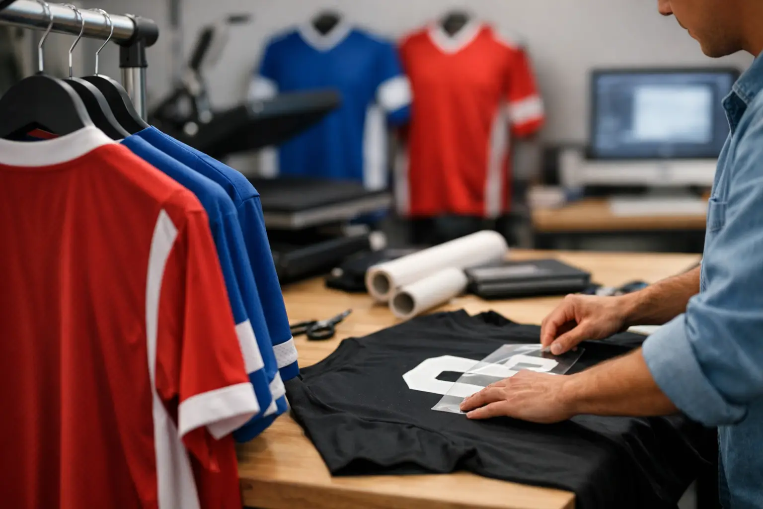
Some personalization methods handle detail and color layering better than others. Screen printing can deliver crisp, bold graphics at scale and keeps costs efficient for larger runs. Heat-applied names and numbers are often a practical choice for rostered uniforms because they allow player-specific customization. Embroidery can add a premium look for logos, but it is not usually the first choice for large player numbers on performance jerseys.
There is no single best method for every team. It depends on fabric, quantity, budget, and the look you want. The important thing is matching the method to the garment and the use case instead of choosing based only on price.
Select the right jersey material before decorating
This step is easy to overlook, especially when deadlines are tight. But fabric affects everything from print adhesion to comfort to long-term wear.
Performance polyester is common in sports uniforms because it is lightweight and moisture-friendly. It also requires decoration methods that work well with synthetic fabrics. Cotton blends may feel familiar and print beautifully, but they are not always the right fit for game-day use. Mesh panels, stretch fabrics, and reversible constructions all create different production considerations.
If the jersey will see heavy play, repeated washing, and regular transport, durability matters more than novelty. A good-looking mockup is not enough. The finished piece has to survive real conditions.
Plan placement like a uniform program, not a one-off shirt
The difference between an average jersey and a professional one often comes down to placement discipline. Front logo position, player number alignment, back name arc, sleeve treatment, and sponsor spacing should all feel uniform from piece to piece.
This is especially important for schools, clubs, and organizations that may reorder later. If your original setup is inconsistent, future additions will never look quite right. Standardized placement gives you a cleaner current order and a much easier reorder process.
Think about future roster changes
Teams change. Players join midseason. Staff members request extras. Youth programs often need replacement sizes quickly. When planning personalization, ask whether your setup can support follow-up orders without reinventing the artwork every time.
This is one reason experienced production support matters. A reliable print partner helps create a decoration plan that can be repeated accurately, whether you need 20 jerseys now or 200 more later. For organizations that order on a schedule, that consistency saves time and avoids quality drift.
Budget for the full job, not just the blank jersey
Personalization costs are shaped by more than the garment price. Quantity, decoration locations, number of colors, roster complexity, and turnaround time all affect the final total.
A lower-cost blank can become a more expensive finished jersey if it requires complicated decoration or does not hold up well enough for the season. On the other hand, a higher-quality jersey may make sense if you need better durability, a cleaner appearance, or easier reorders.
If you are comparing options, look at total value. Ask how the jerseys will perform after repeated washing, how accurate the names and numbers will be, and whether the production timeline is realistic. Fast and cheap only works if the order arrives correct and usable.
Review proofs carefully before production
No matter how experienced the supplier, the proof stage is where you protect your order. Review every detail: spelling, number assignments, font style, jersey color, decoration color, logo placement, and sizing breakdown.
For larger groups, assign one decision-maker to approve the final roster and proof package. Too many approvers usually slow the process and create conflicting edits. Clear approval keeps the order moving and reduces the chance of last-minute changes that affect delivery.
How to personalize team jerseys for long-term consistency
If your team expects to reorder next season, consistency should be part of the first order. Save approved artwork, font selections, decoration specs, and roster formatting standards. That turns a stressful custom project into a repeatable uniform program.
Established providers that handle screen printing, embroidery, and personalized names and numbers under one roof are usually better equipped for that kind of repeat business. It is not only about making one set of jerseys look good. It is about making the next set match.
For organizations that need reliable execution, this is where experience matters. Artik has been producing custom apparel since 1985, and that kind of production history shows up in the details – accurate setups, dependable quality, and a process that holds together when deadlines are real.
The smartest jersey personalization choices are usually the least flashy ones: clear names, readable numbers, durable decoration, and a layout that still looks right after a full season of use. When the design fits the team and the production matches the plan, the jersey does its job long before anyone asks how it was made.